SPICE GROUP - Marketing agency
[EN]
When developing the logo, an attempt was made to reveal the main character and focus on simple uniqueness, setting it apart from its competitors. Because that's exactly what
direction a marketing team capable of finding a solution business problems, must have a unique solution using an example your logo.
direction a marketing team capable of finding a solution business problems, must have a unique solution using an example your logo.
The meaning of the developed logo resembles the letter “S”, that is, the initial letter of the name, and the form “LIGHTNING”, personifying energy. Special shapes demonstrate
the serious nature of this company. And unusual geometric shape shows creativity. Excellent creative solutions in developing a corporate identity with an unusual symbol, character and visual appearance a look that helps him stand out from the crowd.
the serious nature of this company. And unusual geometric shape shows creativity. Excellent creative solutions in developing a corporate identity with an unusual symbol, character and visual appearance a look that helps him stand out from the crowd.
You can see this during the presentation.
[RU]
При разработке логотипа была предпринята попытка раскрыть главного героя и сделать акцент на простой неповторяемости, выделяющей его среди конкурентов. Потому что именно в этом направлении маркетинговая группа, способная найти решение бизнес-задач, должна иметь уникальное решение на примере своего логотипа.
Смысл разработанного логотипа напоминает букву «S», то есть начальную букву названия, и форму «МОЛНИЯ», олицетворяющую энергию. Особые формы демонстрируют серьезный характер этой компании. А необычная геометрическая форма демонстрирует креативность.
Отличные креативные решения в разработке фирменного стиля с необычным символом, характером и визуальным внешним видом, которые помогают ему выделиться из толпы.
Вы можете увидеть это во время презентации.


A unique logo was prepared in a font appropriate designed symbol and in combination with the specified font, revealing the character of the brand.
The font conveys intensity, reflecting energy and image strength and confidence.
The font conveys intensity, reflecting energy and image strength and confidence.
Logo customization is very effective and can ensure smooth and nice solution anywhere as you can see below.


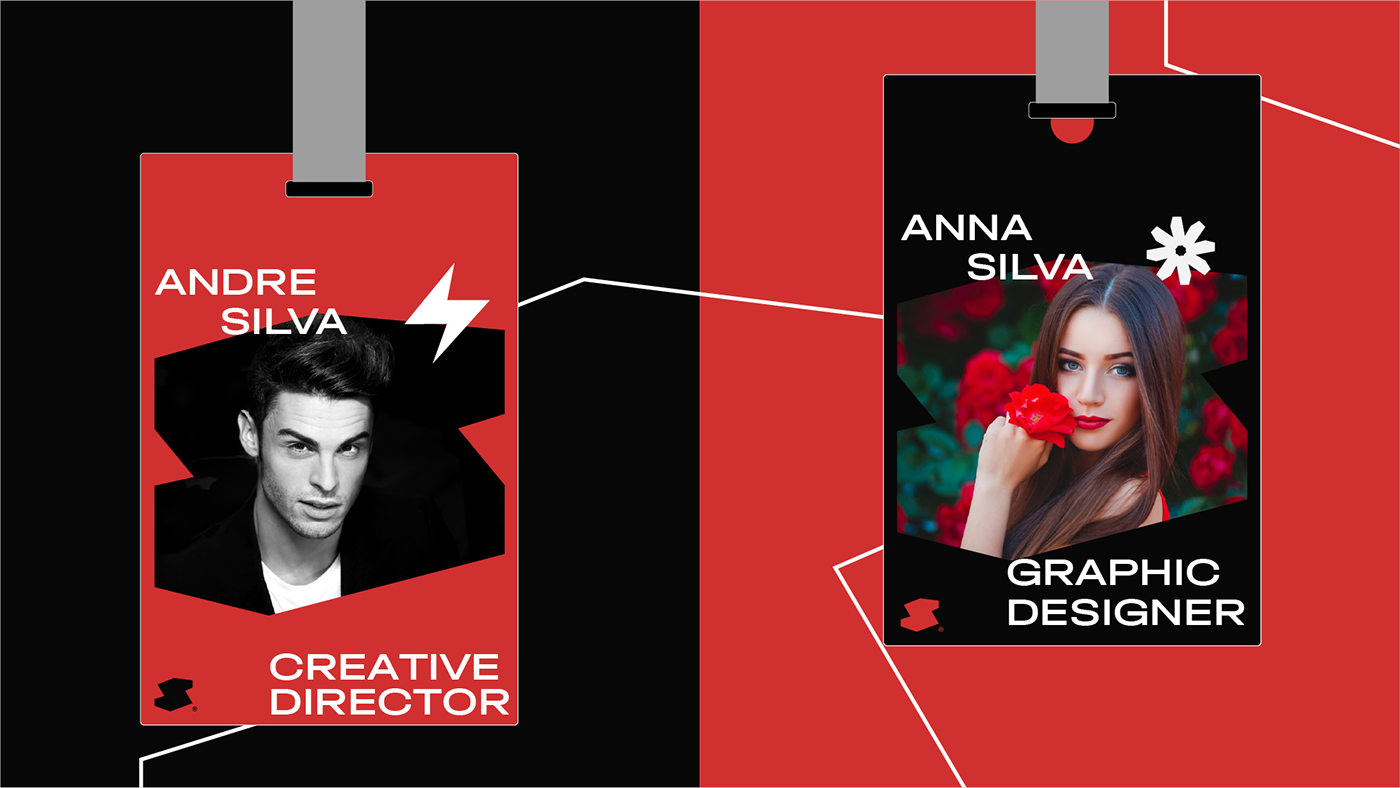
A color study found that red was the best choice. for brand character, logo and corporate identity.
The color red attracts attention, arouses curiosity and encourages to action. Red is psychologically stimulating impact and can be used to improve blood circulation. Red, which represents passion and strength, attracts the most attention.
Red is the color of fire and blood, associated with danger, war, energy, strength, determination, desire and love. black: authoritative, powerful, evokes strong emotions, and too a lot of black can seem overwhelming. black symbolizes power, sophistication, elegance, formality, mystery and the unknown.
Red is the color of fire and blood, associated with danger, war, energy, strength, determination, desire and love. black: authoritative, powerful, evokes strong emotions, and too a lot of black can seem overwhelming. black symbolizes power, sophistication, elegance, formality, mystery and the unknown.
Gray represents confidence and wealth. Basic feeling of confidence